Open Source GIS: QGIS II
On this second session, we'll get a bit more familiar with some of the most usual GIS techniques: symbolization, map composition and some basic geospatial analysis.
Cartography and symbolization are crucial for conveying a message through the visualization of geospatial data. The wrong color scheme, data classification or mapping technique can make your map unreadable, create a wrong idea on the reader or even manipulate ideas on purpose.
Here is a great post from the Design and Support teams at Mapbox, talking about general best practices applied to mapping pandemic data. On the same topic, here is a very interesting thread about bad practices when mapping Coronavirus data.
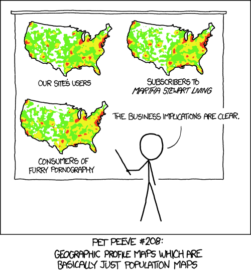
Reading both references above, you'd notice that they agree upon the need of normalizing the data. Data normalization is a very important step when creating visualizations. Rather than showing absolute values, we should always calculate ratios, percentages, weighted averages, divide by population, by area, or any other operation that gives context to the data and help the map's reader to understand the visualization and the underlying data analysis.
For example, without normalization, almost any measure we want to visualize that is relative to human behavior, will look like a population map: there is always more probability of occurence of any phenomenon where there are more people living.
Here are XKCD's views on the subject:

Once you are more familiar with the first concepts, as loading and visualizing geospatial data, we can start getting into geospatial analysis. The Wikipedia entry about Spatial Analysis is actually a very good introduction to the matter, that I recommend reading carefully.
How can geospatial analysis help in Urban Planning / Development? It can help us determine how growing populations affect energy consumption, transportation, public services or housing resources. It also allows for compiling and cross-filtering data from many sources to see how crime, public health, education and housing/real estate outcomes vary by location. (from this article).
New data streams, as such provided by telco companies, mobile GPS data or real-time traffic information can help the urban analyst to draw a new picture of life in the cities.
Exercises
- Add some text labels to your map.
- Learn the basics about data classification and color ramps. You can also take a look at ColorBrewer, a very well known tool that helps choosing color palettes for maps; and to CARTOcolors, more modern color palettes by Mamata Akella.
- Learn more about Proportional Symbols, best practices and Cartography principles.
- Create a printable map layout.
- Analyze data and solve a spatial problem with GIS techniques following this section